October 9, 2016
original article written by Net Advisor™
WASHINGTON, DC. There has been much misinformation that has been pushed to American to make them think that the U.S. economy is better off and so are Americans. Being better off is a relative question and can depend on where you like, the local job market and local economy and one’s personal net-worth or overall happiness.
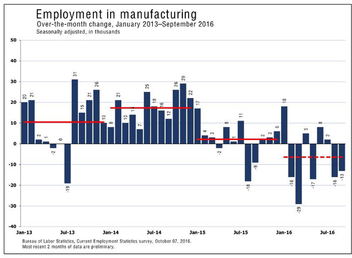
One might argue the economy is better than it was in say 2007-2009. But we can also say the U.S. economy was better off in the mid-1980’s. We can further say the economy is better off since the 1930’s. In general how are people really doing now?
We just pulled a bunch of charts from the St. Louis Federal Reserve, U.S. Census, 3rd party research, and proprietary research based on the U.S. government’s own data, which has some mixed results. We hope you like charts, because here they are:
[1] Negative U.S. Trade Balance: Creates Demand for Foreign Jobs
U.S. Trade Balance has consistently shown that the U.S. is a net importer than exporter. This means we buy from foreign countries more than we produce in the USA.
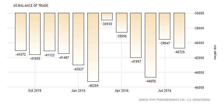
“The United States has been running consistent trade deficits since 1976 due to high imports of oil and consumer products.
In recent years, the biggest trade deficits were recorded with China, Japan, Germany and Mexico.
United States records trade surpluses with Hong Kong, Netherlands, United Arab Emirates and Australia.”
— DTD Oct. 2016. Credit/ Source: Trading Economics.
The U.S. under Bill Clinton (D), George W. Bush (R) and Barack Obama (D) have done very little to change this picture. The result is the U.S. negative trade balance is creating demand for FOREIGN jobs, not U.S. jobs.
It does not seem to be a surprise then to see that the number of people in the U.S. work force has declined with more job demand continually moving outside the USA.
[2] Civilian Labor Force Participation Rate
The Civilian Labor Force Participation Rate has been on decline since the late 1990’s under President Bill Clinton. Some of this can be attributed to retirees of Baby Boomers and advancement in technology. But the U.S. has also exported millions of American jobs since the passage of NAFTA and GATT over this same period.
- Millennials overtake Baby Boomers as America’s largest generation (Pew Research, 2016)
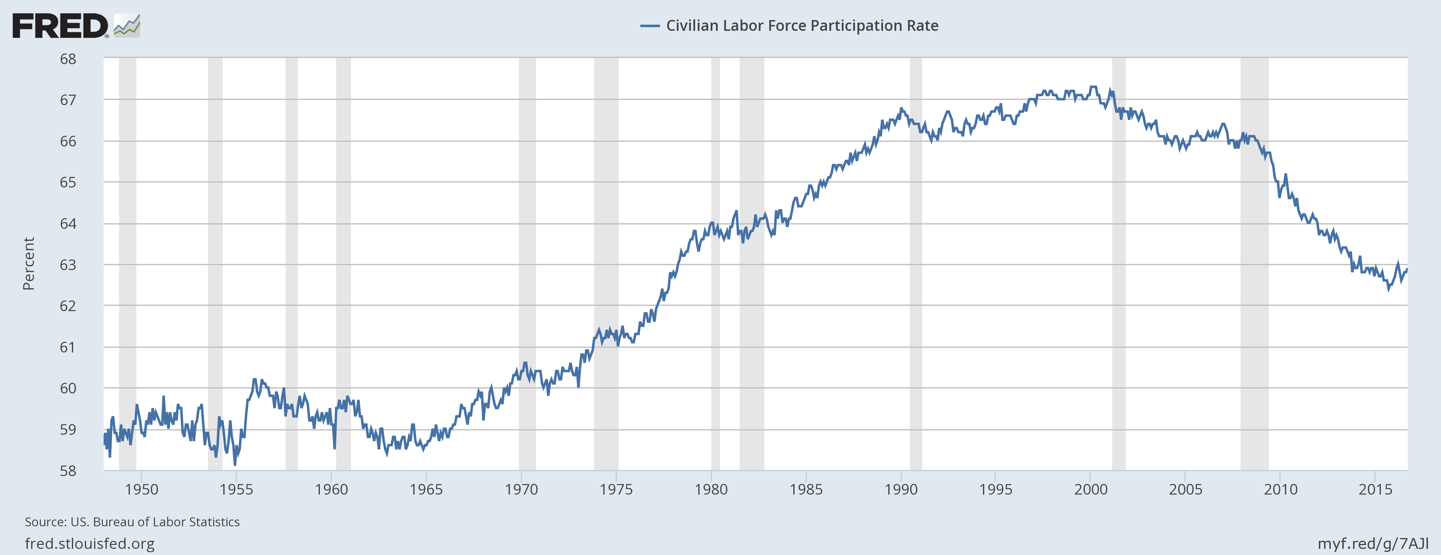
Notice the dramatic drop in labor force participation (above) since the “end” of the last recession (2009).
In the 1992 Presidential election, only one political candidate warned us about NAFTA before President Bill Clinton won the election and passed it with Vice President, Al Gore being the tie-breaking vote in the Senate [See Report, Points 6 through 9].
#Flashback 1992: #RossPerot WARNED About #NAFTA, Loss US #Jobs. US Trade Policies Unfair to American Workers #Trump pic.twitter.com/vCudgUy3hy
— NetAdvisor.org® (@NetAdvisor) June 28, 2016
[3] Welfare Soars Under President Obama
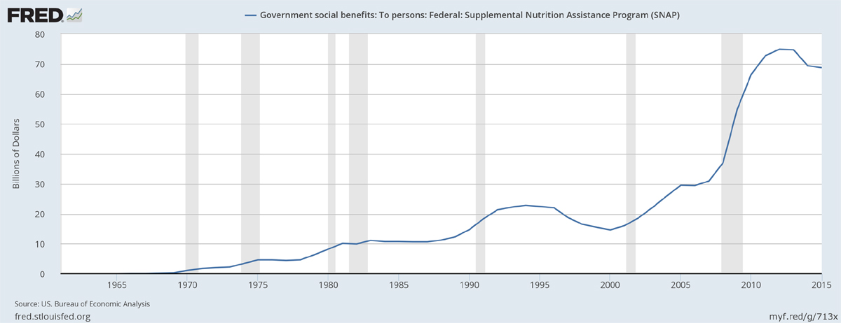
The U.S. (food) welfare rate has soared under President Obama. The chart below shows a decline in SNAP benefits but this does not include 2016 (not yet published).
Take notice in the above chart that even AFTER the 2008-2009 recession was “over,” millions of people in American still need help to eat. This tells us the economy really isn’t so rosy when people need economic assistance to buy the basics such as food.
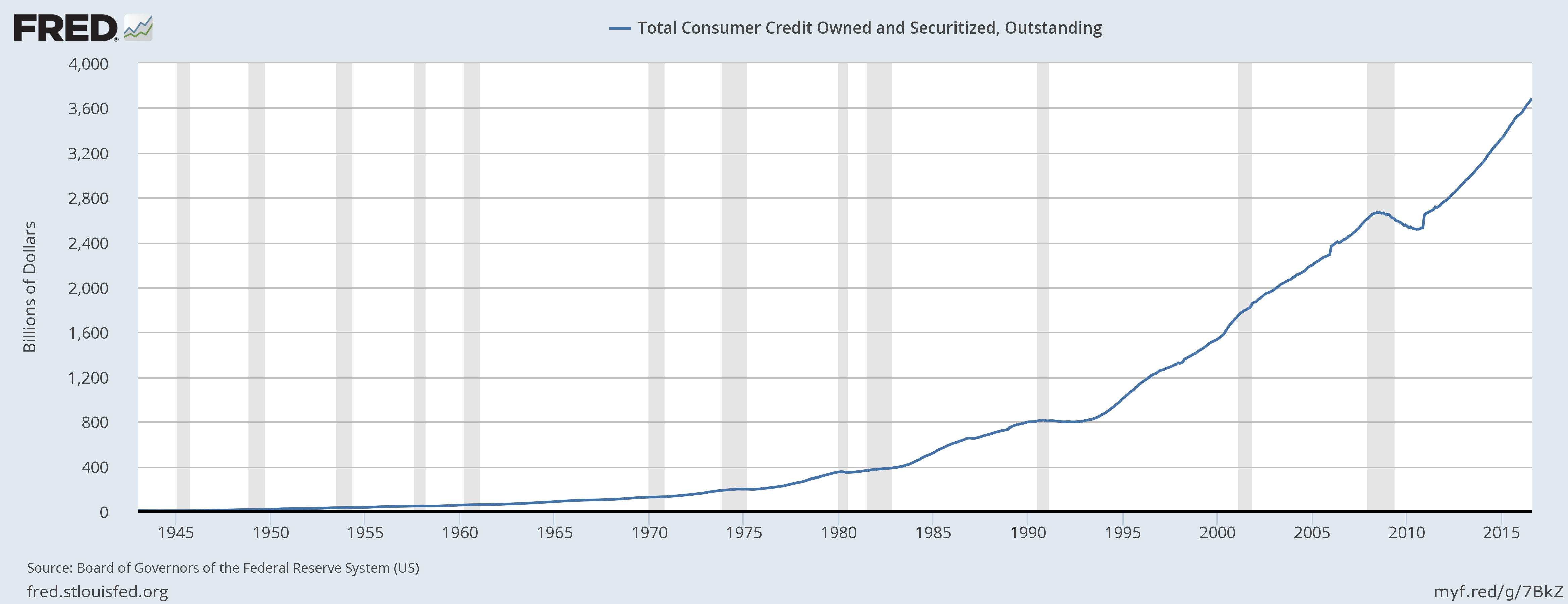
[4] Total Consumer Debt At All-Time High
Next we see that the Total Consumer Debt is at an all-time high. Notice where consumer debt peaked in 2008-2009 and that was a huge domestic and international economic crisis back then. Then notice where we are today. U.S. consumer personal debt is currently pushing near $4 Trillion.
[5] U.S. Consumer Motor Vehicle Debt At All-Time High
We also see this same record debt picture with U.S. consumer motor vehicle debt.

[6] U.S. Mortgage Debt Climbing Back to All-Time High
We also see mortgage debt getting close to where they were before the economy virtually collapsed in 2008-2009.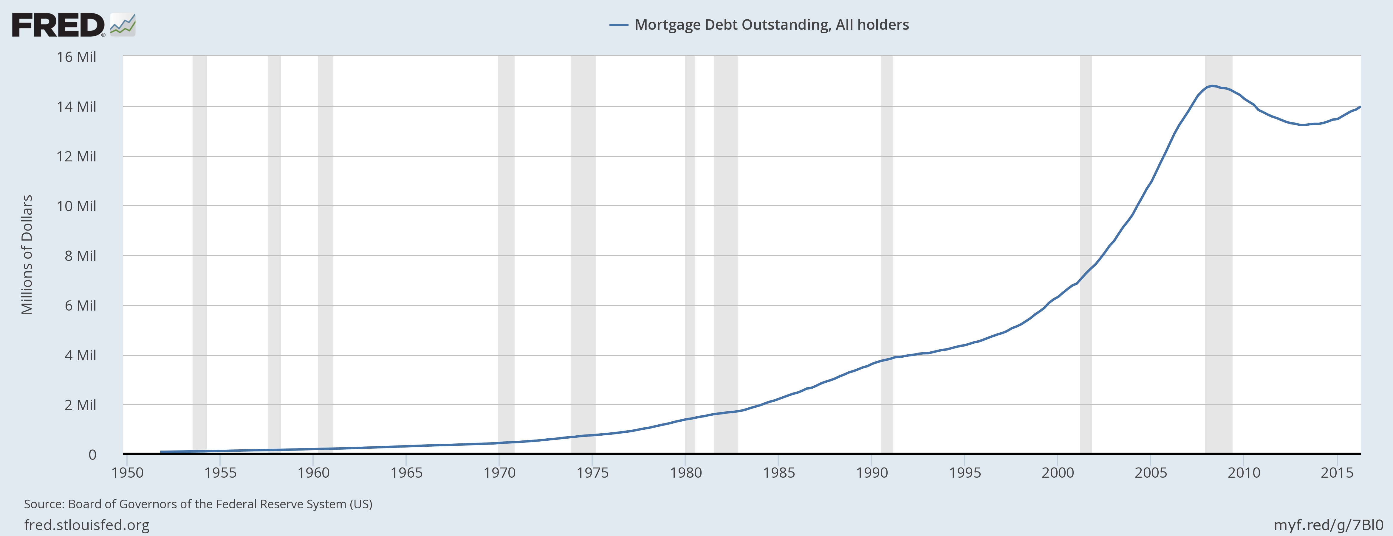
[7] U.S. Home Ownership Rate Lowest Since 1965
So we have to ask the question. If consumers have record borrowing on home mortgages, where are fewer consumers able to afford them? Notice since the Obama Economy recovery (2009), U.S. Home Ownership Rate is the lowest point since 1965.
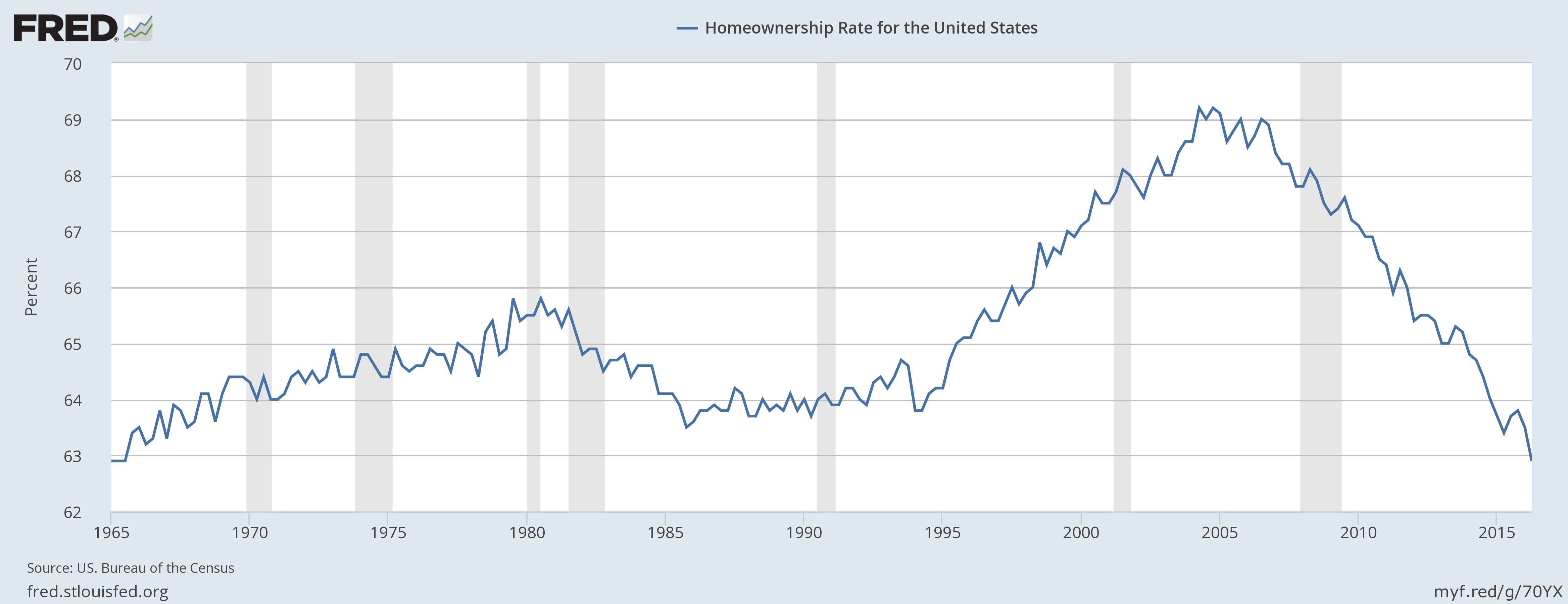
We found that home prices are up in major states such as California, Texas, New York and Florida (and on average prices are higher across the USA), but this still does not explain why with all these mortgages out there, fewer people are able to afford homes?
[8] Student Loan Debt at an All-Time High
Since the Obama Administration decided to cut private lenders (banks) out of the student loan business and took it over in 2010, student loan debt has soared to an all-time record high.
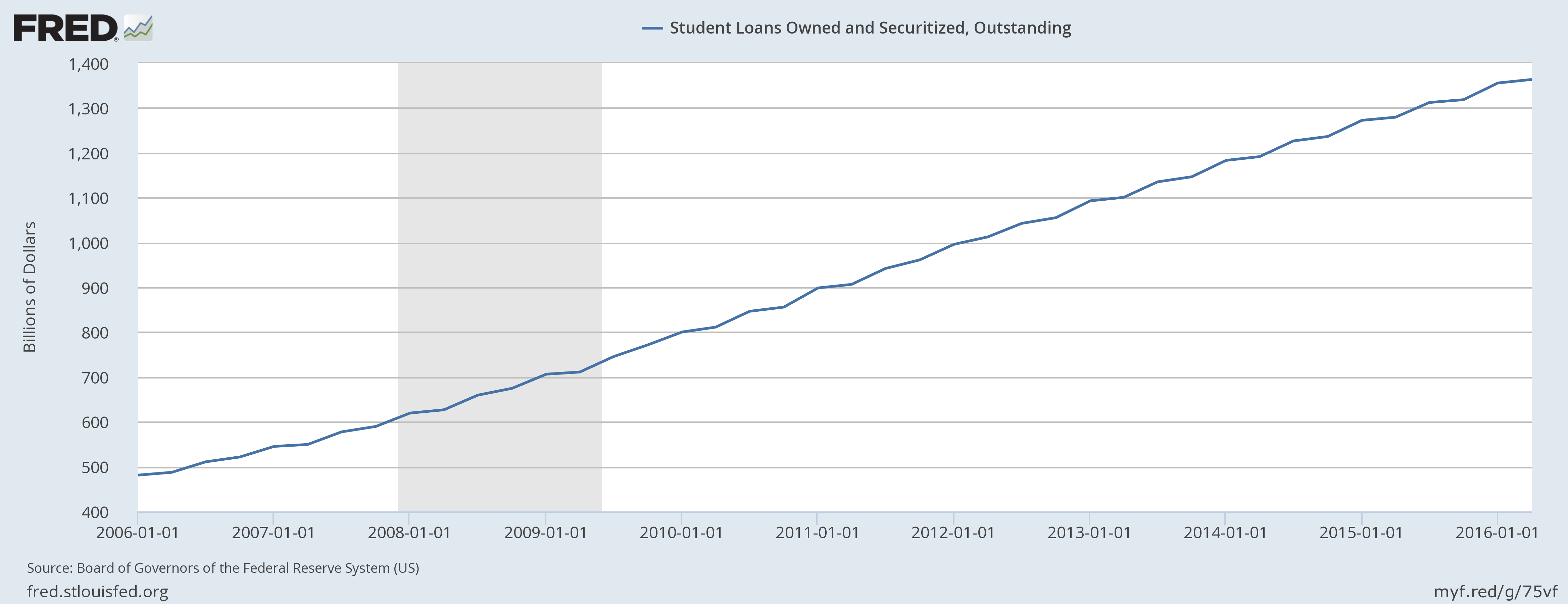
The U.S. government actually made a $51 Billion profit off students in 2013 or about $120 Billion since 2008. Why would anyone think that the government would give free education and give up being more profitable that Exxon-Mobile or Apple?
Does anyone think that the federal government would just forgive $1.4 Trillion in student loans and dump all that onto working taxpayers?
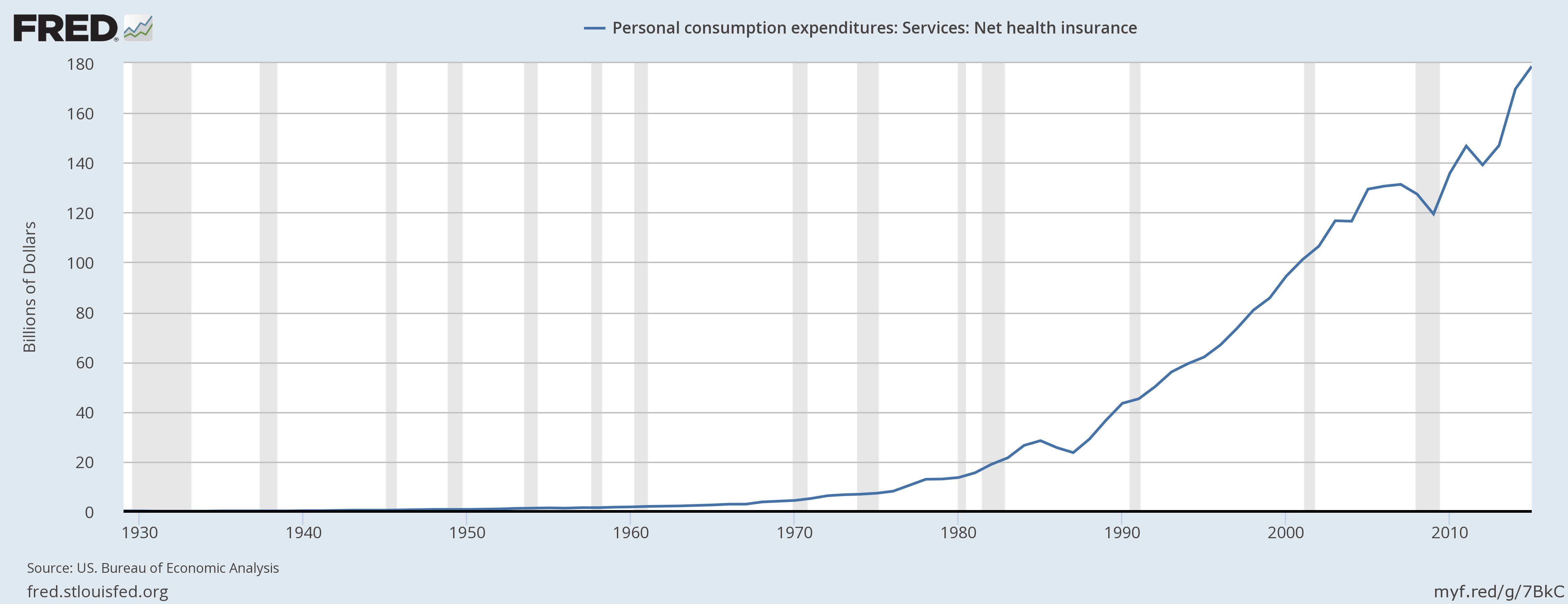
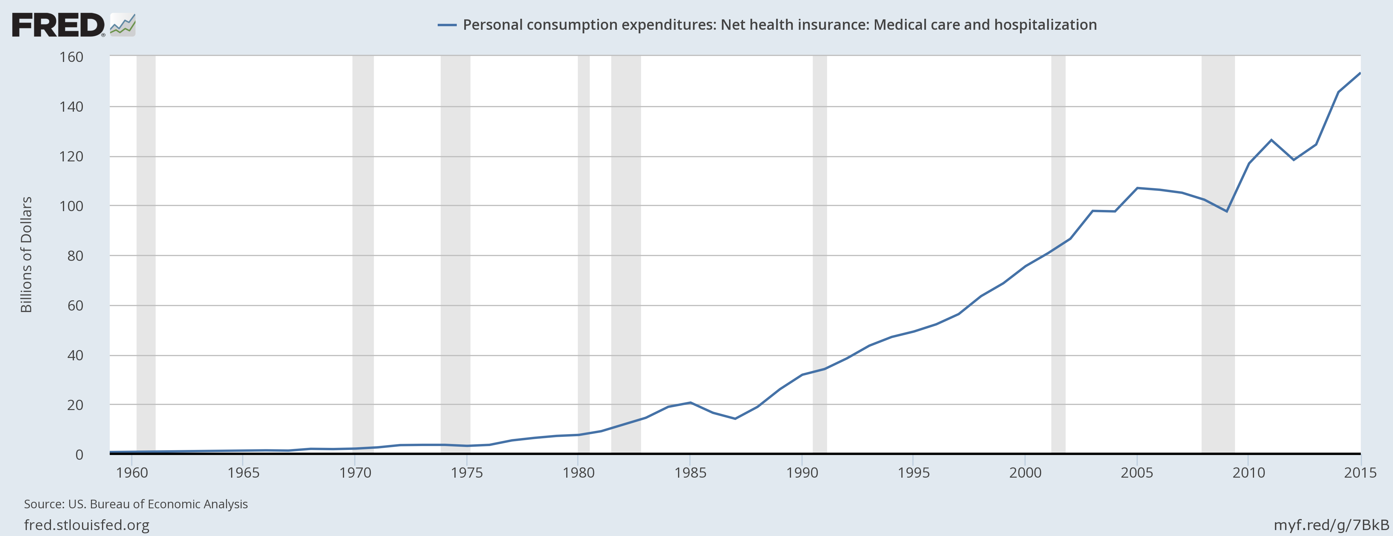
[9] Healthcare Costs Soaring in USA
The following two charts show healthcare costs and expenditures have skyrocketed since the passage of the “Affordable Care Act” (ObamaCare) in 2010.
[10] Think Socialized Healthcare is Cheaper in Europe? Guess Again.
European Union healthcare costs have trended HIGHER for over 20 years.
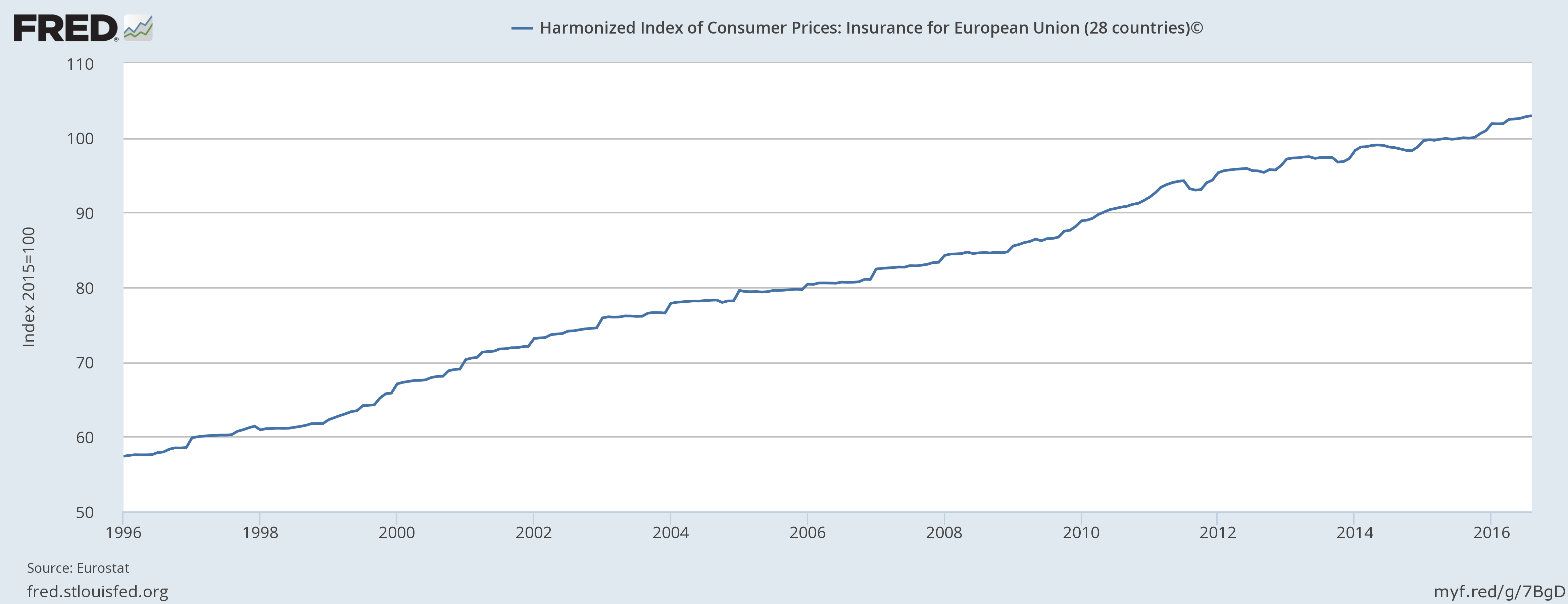
Is this (above chart) the socialized healthcare model that the U.S. wants? Would you like your healthcare costs to rise over the next 20 years too? There is no current plans to make this better in EU or the U.S.
[11] Bright Side: Personal Income Up
On the bright side, the average person income has increased over the years, albeit slowly.
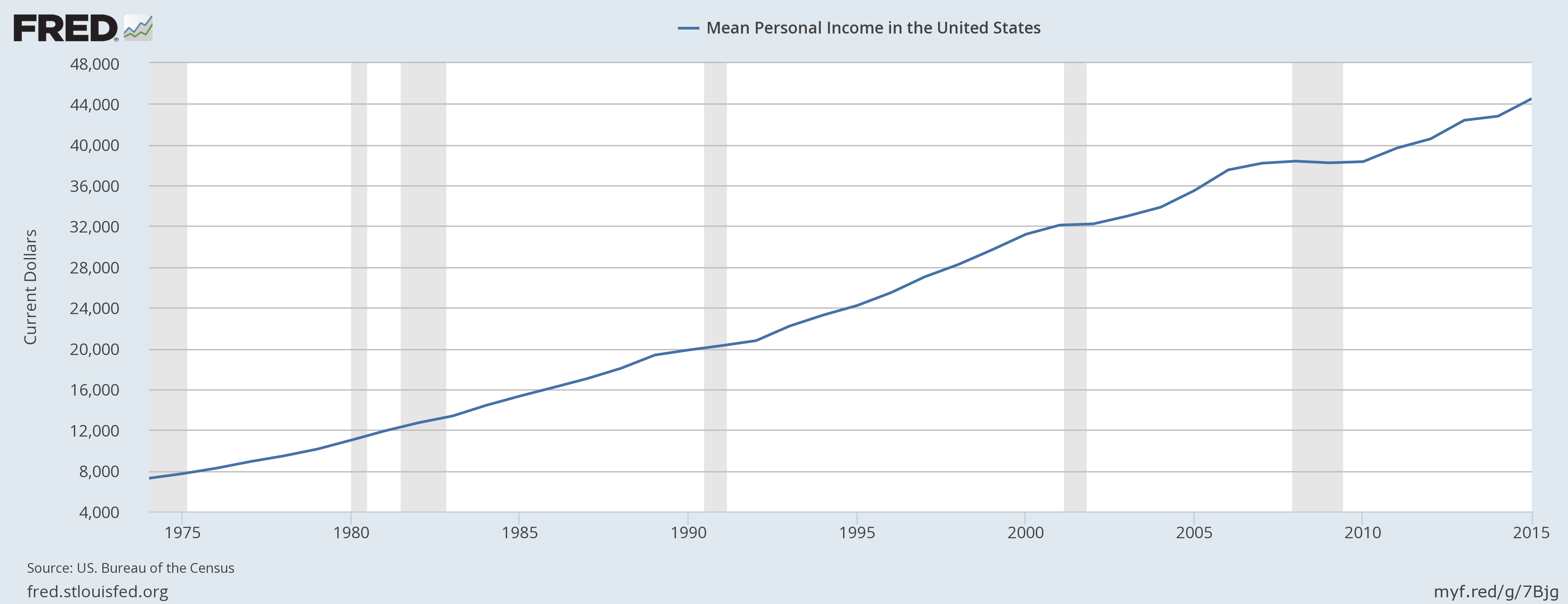
Personal income flat-lined or went down a bit during the last recession. But notice personal income actually rose during the 1980’s recessions. Household income peaked in 2007 (real estate market peak), and fell through 2012. It has finally climbed higher, but household income is still well below its high in 1998 (pre-dot com crash).
[12] Official Unemployment/ Underemployment at 9.7%
So The U.S. government says the unemployment rate (which factors out many people) is about 5%. When you include the people who are factored out based on the St. Louis FED’s model, the actual number of unemployed and underemployed (those who can’t get a full-time job, settling for part-time work) is currently 9.7%. This number peaked in 2010 at nearly 17% which was a record high since 1994.
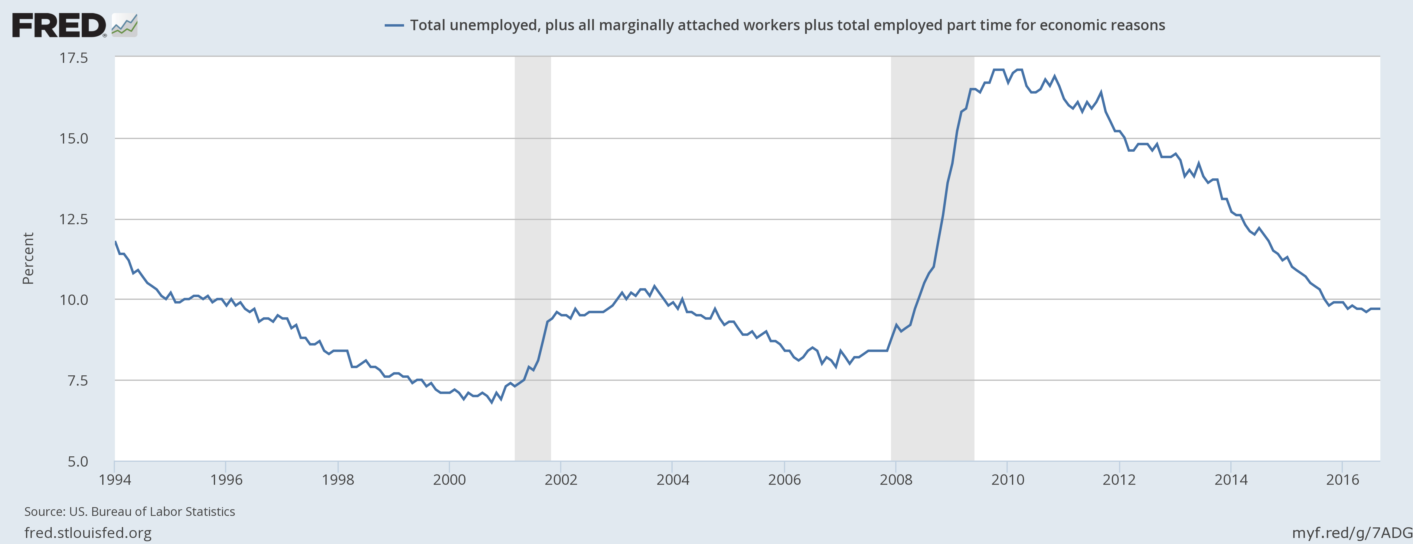
For years we have challenged the government’s math on the U.S. unemployment rate.
If the U.S. economy was doing so well and unemployed at “official” lows, then why can’t millions of people in America afford to eat?
Based on the most recent report of the Bureau of Labor Statistics, if you take the U.S. population who are deemed able to work (The Employment Population) at 59.8%, then subtract 100%, you get 40.2%. This is the number of people in the U.S. who are part of the official Employment Population, and yet have no job.
#JobsReport Analysis:
Real Unemployment Rate?
40.2% America Who Are Considered
"Employment-Population" Have NO JOB. https://t.co/sh6P16ftbO— NetAdvisor.org® (@NetAdvisor) October 7, 2016
When you look at the total employment population, you also have to look at who is not being counted.
Officially speaking, in 2015, the Bureau of Labor Statistics ADMITTED that only 80.3% of Americans were employed. Thus, that would argue that 19.7% of Americans were unemployed. This seems to conflict with the official unemployment data.
Maybe the theoretical unemployment rate could partly explain the next chart:
[13] Record Poverty in U.S.A. – Worst Since 1959
If the economy was doing so well, how come according to U.S. Census, more Americans are in poverty than at any time since 1959?
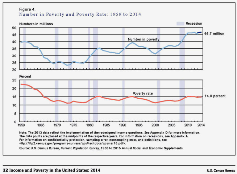
Well, I have argued that the U.S. economy really isn’t growing to show a noticeable difference.
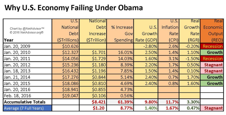
What has grown is the size of government and the National Debt.
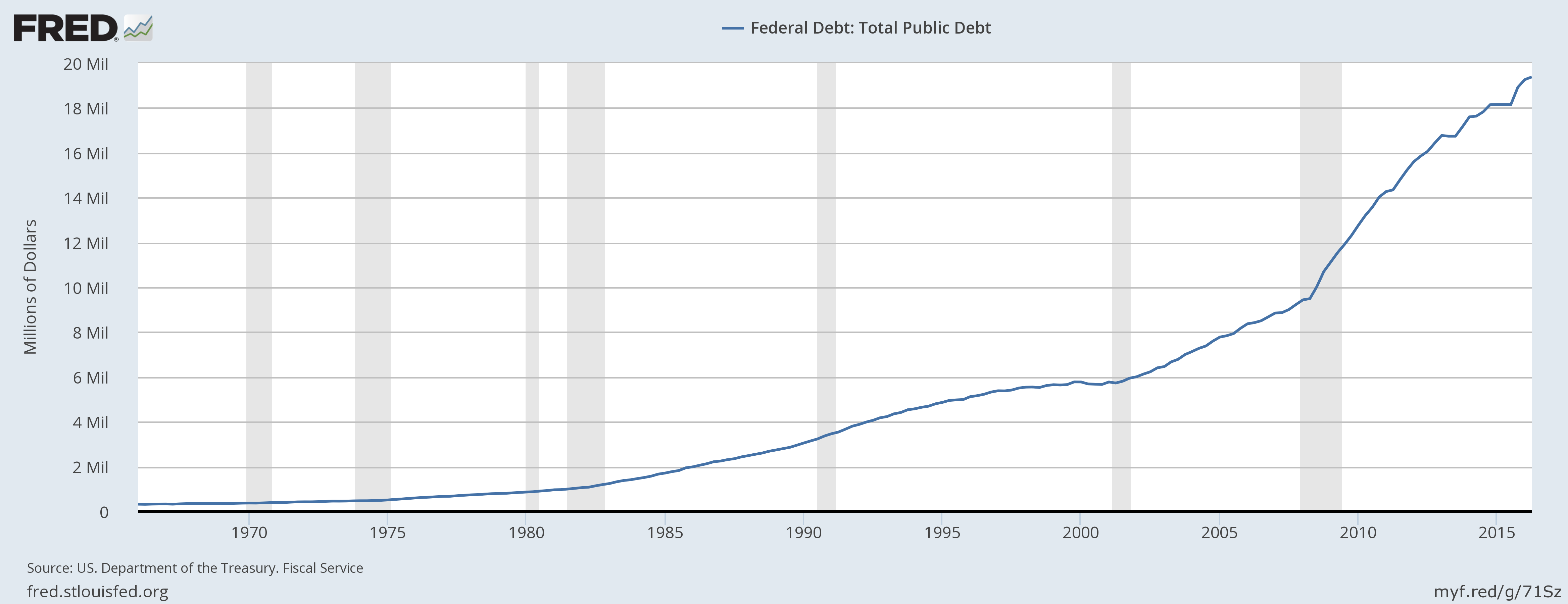
[14] Total U.S. National Debt At All-Time Record High
U.S. debt began materially climbing since the 1970’s. But under President Obama, the U.S. National Debt has nearly doubled and is expected to double to $20 Trillion by the end of his second term (Jan. 2016).
Since January 2009, the U.S. government grew 61.39% while the U.S. economy had and average growth of 0.47% (less than one-half-percent)(Real Growth Rate). One might ask: With over $8 Trillion in debt spending, in addition to the existing tax money spent, the simple answer is more government spending did not create economic Utopia.
[15] U.S. Federal Reserving Holding $2.8 Trillion U.S. Debt.
When it comes to stimulus and spending, the FED has artificially kept interest rates low. For years there was good reason, mostly to allow everyone (individuals, families, business, banks, and governments) to refinance debt at lower costs.
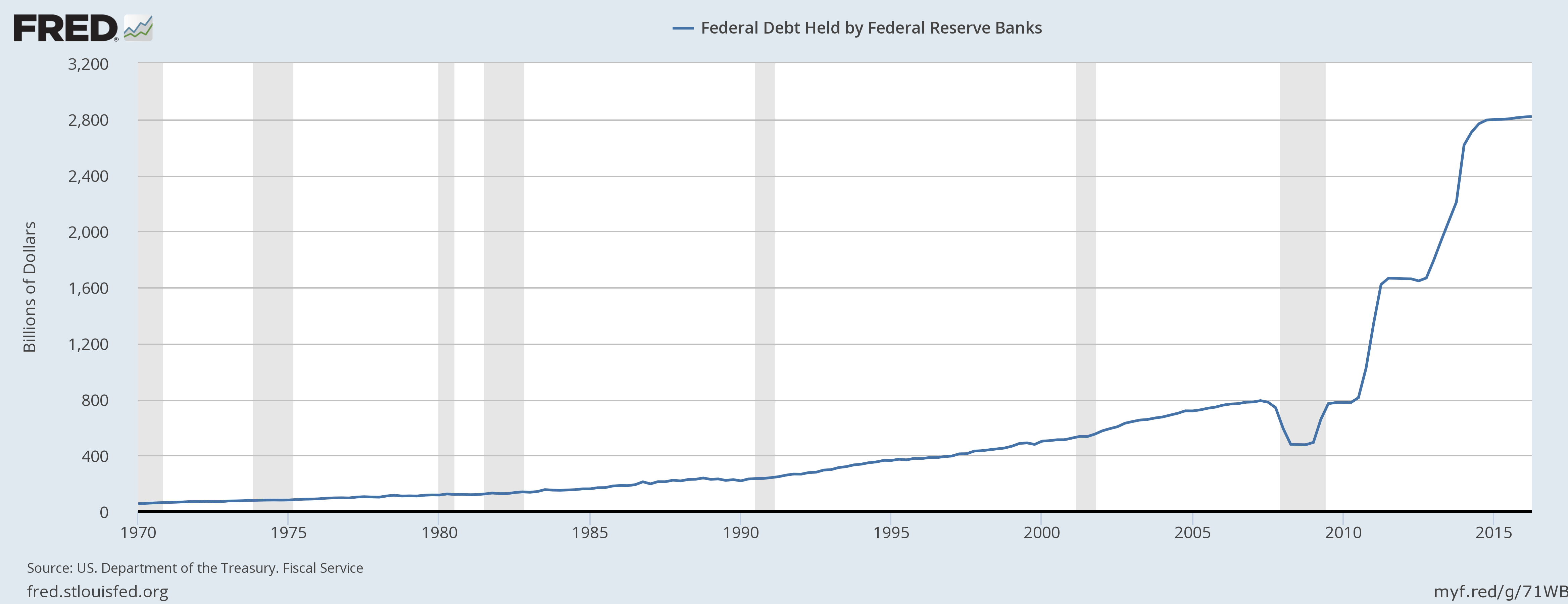
Notice the ‘Recession Ended in 2009,’ and the FED continued to provide economic stimulus for the last six years. When and if the FED really decides to take the punch bowl away from the party (ie: materially raise interest rates), all the debt we have talked about above (government debt, student loan debt, auto debt, mortgage debt, FED’s debt, and especially consumer debt, everything with an adjustable interest rate will cost MORE.
This is exactly what happened (sharp increase in FED rates) to pop the real estate bubble in 2006, and what killed the Dot-com market in 2000-2001.
[16] U.S. Debt as Percentage to GDP
I sometimes get people trying debating me in social media which is fun and entertaining. Sometimes they argue fantasy math about how the deficit is down. Or they argue that U.S. deficit is down as a percentage of GDP. Or they send me some other false, misleading, or outdated graphic that are 5 years old.
We already discussed the current U.S. National Debt above. We discussed the difference between deficit and debt back in 2010. In terms of the current U.S. debt as a percentage of GDP, we are at about 115% of GDP.
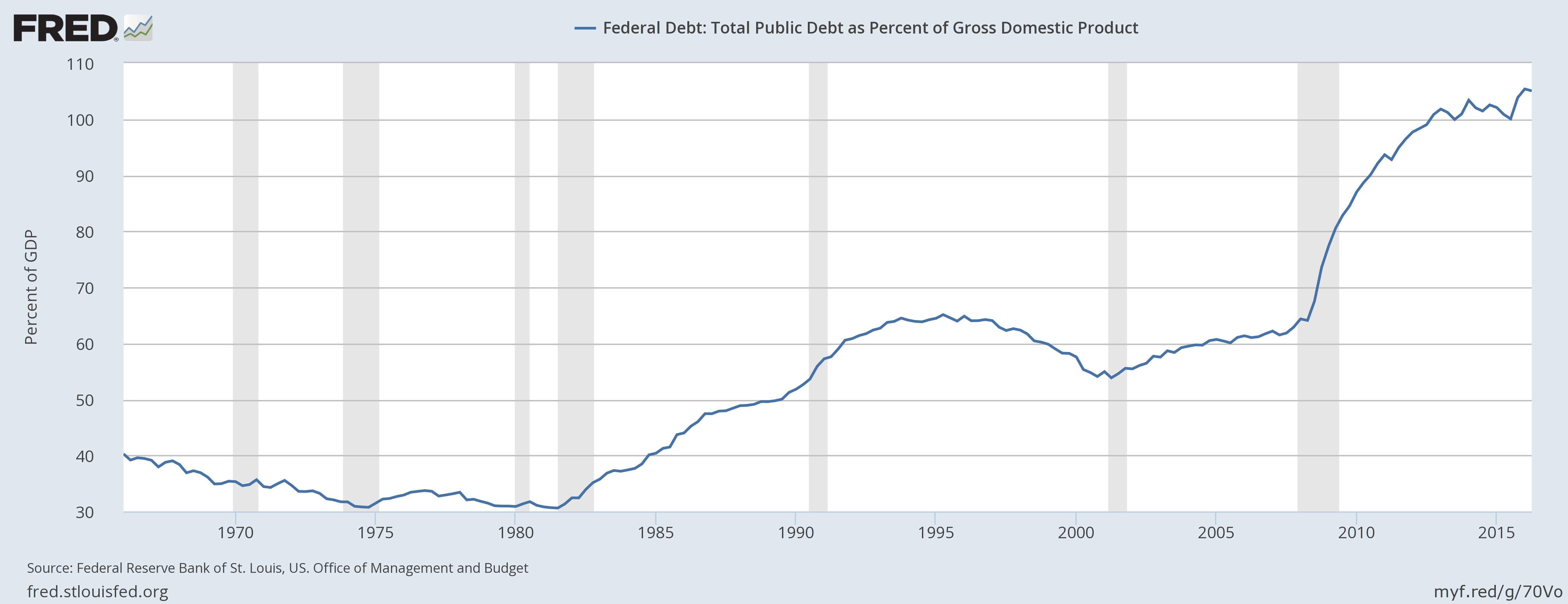
This means if we liquidated the entire U.S. economy right now, we would still owe more money than we could possible produce. We talked about this risk in 2013, and we have already exceeds that risk today.
We are not the only ones with concern about U.S. debt.
In 2011, S&P (Standard and Poor’s) Credit rating Agency DOWNGRADED U.S. credit rating. This was the first time this has ever happened since the U.S. established a credit rating in 1917. By 2012, Egan-Jones DOWNGRADED U.S. credit rating after the FED announced a new round of stimulus. Moody’s has put the U.S. government on notice at least five times about downgrading U.S. debt.
[17] Commentary – Election 2016
As we have shown by the government OWN data, the U.S. has real economic issues. The political Establishment has failed to solve or reasonable address any of these issues. It is American taxpayers who suffer for their failure. IT seems that much of the media wants to ignore these truths. Instead many in the media and political elitists want to try and distract with petty issues.
We can continue to write about the true picture of the U.S. economy until the American People have decided they had enough of failed policies that negatively impact their lives. The questions are: Do you feel that government cares and represents your interests? Do you feel that you are really better off? If the answer to any of these questions is no, then maybe it’s time to try something different.
We performed an economic and tax analysis of both the current Presidential candidates for further review. Yes, we understand that they are always reasons to like or dislike people, politicians for one thing or another. Regardless of such, the fact is one of the candidates will become President in January 2016.
Based on one’s decision to vote or not vote, the tax, economic, and legal policies the next President put forth will decide whether the U.S. turns itself around, or go down like Ancient Rome to a 3rd World Nation.
Hard to conceive, but the data and policy statements of the two candidates show two distinct directions. More of the same which led to our current situation, or anything different.
Election Reports:
- Election 2016: Compare Trump v Clinton on Taxes
- Is the U.S. Constitution at Risk in Election 2016?
- Why Voting and Elections Matter
- The Cost of Not Voting: 7.2 Million Registered California Voters Did Not Bother to Vote
image credits as noted
original content copyright © 2016 NetAdvisor.org® All Rights Reserved.
NetAdvisor.org® is a non-profit organization providing public education and analysis primarily on the U.S. financial markets, personal finance and analysis with a transparent look into U.S. public policy. We also perform and report on financial investigations to help protect the public interest. Read More.

