February 29, 2016

Analysis: Why The U.S. Economy Failing Under Obama
Original article written by Net Advisor™
WASHINGTON DC. For years, political pundits have touted this myth how well the economy is doing, the stock market is up (compared to March 2009), the unemployment rate is low and all these new jobs have been created under Obama’s policies. Some have even tried argue that the deficit is going down.
There seems to be this disconnect as actual data just doesn’t seem to fit this narrative. This report is an economic analysis to explain in real numbers how the U.S. economy is really doing.
#Propaganda Exposed: U.S. National Debt Up 79% Under Obama https://t.co/4e5ALq4HpI #Economy #Election2016 #USDebt pic.twitter.com/h80X3H3koP
— NetAdvisor.org® (@NetAdvisor) February 22, 2016
[1] Redistribution: Not a Model For Economic Growth.
We’ve discussed the high costs of Obamacare (2016 Obamacare cost increases), high cost of regulations, more people losing their health insurance, increasing higher unemployment claims, higher taxes [see Point 13], and that we now have more people living in poverty since 1959.
What we really have is wealth redistribution, including to non-U.S. citizens, and even this isn’t making American better.
- 93.7% Immigrant Families With 4 Kids on Welfare
- 90% Recent Middle East Refugees on Food Stamps, Almost 70% on Cash Welfare

After reading hundreds of pages of government economic and financial data, I have come up with this theory to answer the question why the U.S. economy is failing under Obama?
The answer is the Obama Admin has their priorities all wrong. Some might say, we’ll we know that — but can we quantify it? That answer is, ‘yes, we can.’
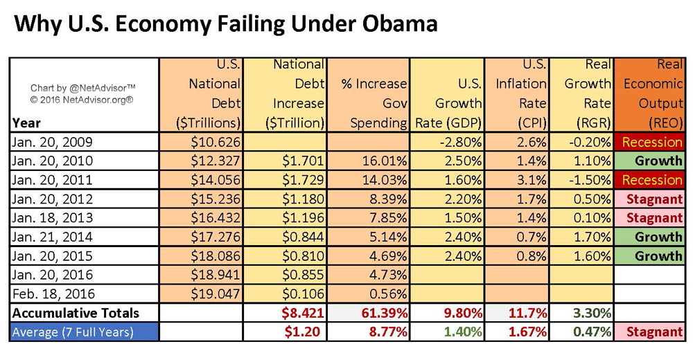
I extracted data directly from government (Obama Administration’s) own records. I used key data such as U.S. National debt, calculated the annual debt increase, and looked at the annual spending increase of the size of U.S. government.
U.S. debt under Obama thus far is $8.421 Trillion or averaging additional debt of $1.2 Trillion per year from Jan. 20, 2009 to Feb 18, 2016.
The entire U.S. debt from George Washington (beginning Apr. 30, 1789) to George Bush (ending Jan 20, 2009) was $10.626 Trillion. Thus Obama has increased U.S. debt in 7 years by 79.25%. Obama is on-track to exceed U.S. debt in 8 years that previously took 220 years to rack up.
[2] Obama Gov Spending Increased By 61.39%.
Next, I calculated the spending increase of the U.S. government and found that the federal government increased its spending by 61.39% under Obama [See spread sheet chart, page top, column 4 (% Increase Gov Spending), then see “Accumulative Totals”].
[3] Short Term Deficits Down After GOP Began Taking Control.
The sort of good news occurred when the spending rate was cut almost in half after Republicans retook the House officially in 2011, reducing the impact of the 2012-13 budget. With a divided Congress, government spending was still high.
When the GOP retook the Senate officially in 2015, government spending decreased by about 75% compared to 2010-11 when Democrats controlled both Houses of Congress. (See spread sheet chart again, page top, under % Increase Gov Spending, then notice change for each year. Also see Who Controlled Congress below).
Note: We did not include the fact nor the debt associated in our chart to when the Democrats controlled the budget during the Bush Administration [Jan 2007 (110th Congress) to Jan 2011 (111th Congress)]. If we did, our chart numbers would look much uglier, and the economic picture would be bleaker. For this report, we are focusing on the activity of the current Administration.
[4] Who Controlled Congress?
Presidents typically are the final person to stop bills in the House and Senate by way of Veto. Sometimes Vetoes are abused when a majority of a House and Senate supports Constitutionally-backed legislation and a president blocks it.
Here we summarize of who is running the government and when over the last 10 years to the current term.
110th Congress: House (D), Senate (D), POTUS (R)/(D)* [Jan. 3, 2007 to Jan 3, 2009].
111th Congress: House (D), Senate (D), POTUS (D) [Jan. 3, 2009 to Jan 3, 2011].
112th Congress: House (R), Senate (D), POTUS (D) [Jan. 3, 2011 to Jan 3, 2013].
113th Congress: House (R), Senate (D), POTUS (D) [Jan. 3, 2013 to Jan 3, 2015].
114th Congress: House (R), Senate (R), POTUS (D) [Jan. 3, 2015 to Jan 3, 2017].
*George Bush (R) POTUS during 110th Congress until Jan 20, 2009. Barack Obama (D) POTUS during the same 110th Congress since Jan 20, 2009.
The problem is both Houses have increased the debt and Obama has been happy to sign off on all of it without question, getting pretty much everything he wants.
With trillions of dollars in government (debt) spending, surely we should have created utopia by now right?
[5] Add GDP to the Equation.
Next, to further calculate my economic hypothesis, I added government debt spending to my spreadsheet (above). I then looked at the U.S. GDP (Gross Domestic Product) – the ‘growth rate’ of the USA. The data found that we had a total growth of 9.8% in GDP over the last seven years. This sort of sounds good until you divide that growth by seven to find the average over seven years which is 1.4% GDP growth.
Some might say, we’ll isn’t some growth better than no growth? Yes it is, until you start factoring more data that off sets this growth: Inflation.
[6] Subtract Cost of Inflation from the Growth Rate.
Next, we add the inflation factor to our economic picture. Over the same said seven-years, the total U.S. inflation rate (Consumer Price Index or “CPI”) was 11.7%. When you divide that by seven years, you get an annual inflation (CPI) rate of 1.67%.
Keep in mind that that the government’s Consumer Price Index or “CPI” EXCLUDES food and energy prices. So as long as you don’t need to eat, fuel your car, cook your food or heat your home, the government thinks those costs don’t affect you in daily life.
Hypothetically, if we looked at commodities prices over the last seven years for food products (prices +15.97%) and average energy costs (crude oil only prices down -6.78%), we would see a net additional inflation increase of +9.19%, making the true economic picture again more bleak at +10.86% inflation. Again this does not include other energy costs, just petroleum (oil). Also, keep in mind the FED and the U.S. government doesn’t factor these costs into the inflation rate (CPI).
To satisfy the FED and the federal government’s economists, we will pretend that food and energy costs are not factored into our equation too, and we’ll just use the government’s own numbers.
[7] Working Definitions:
After further number crunching, I came up with what I refer to as, Real Growth Rate (RGR) and Real Economic Output (REO).
- Real Growth Rate (RGR): Is actual net growth of an economy after inflation. To calculate: Take Gross Domestic Product (GDP) and subtract the Consumer Price Index (CPI) which equals Real Growth Rate (RGR). In short: GDP – CPI = RGR. (General definition here.)
- Real Economic Output (REO): Real Economic Output is my interpretation of the Real Growth Rate (RGR). There are three outcomes to RGR data as it pertains to growth.
(1) Growth: Annual growth rate of one percent* or more.
(2) Stagnant: Annual growth was positive or had trivial gains from .01 to 0.99%.
(3) Recession: Annual growth that resulted in a negative growth rate, below .00%.
*One percent is not impressive but we had to make a determination to define growth. We are being generous with calling one percent as “economic growth.” Anything above 0% but under 1% we consider as stagnate (growth).
[8] Taking Our Math Model, Translating Back to English.
After inputting all this data into my chart and checking the math formulas so they are consistent, we can now look at the full-year results of the U.S. economy from 2009 to 2015 with a mathematical model and interpret the numbers back to English.
Remember earlier that we found that the official U.S. growth rate (GDP) over 7 years averaged 1.40%, and the inflation rate (CPI) averaged 1.67%. The true result shows the costs of living exceed the benefits of economic growth = -0.27%.
- MATH: US Growth (GDP) (+1.40%) subtract Inflation (CPI) (-1.67%) = Real Growth Rate (RGR) of (negative) (-.027%).
Our chart shows a positive Real Growth Rate (RGR) number of +.047% because there are no annual GDP or inflation numbers covering this short period between Jan. 20 to Feb 18, 2016.
When we add government spending over this 28 day period (Jan. 20 to Feb 18, 2016), to our 2009-2016 model, gives us an average negative growth rate of -0.27% (RECESSION).
This is what I argue is hurting the poor and middle-class; they just can’t get ahead with this massive government spending that does not produce real consumer growth. Arguably, along with massive over-regulations, can help explain why jobs are more scarce and competitive because real growth just isn’t happening. The U.S. economy is actually downsizing however slightly under Obama.
- The Year in Regulation: EPA, Health Care Rules Drive Burdens
- Obama to call for $10-per-barrel oil tax to fund clean transport
- White House Quietly Releases Plans For 3,415 Regulations Ahead of Holiday
Recall over the last seven years, government deficit spending increased 61.39%. Politically speaking more debt spending is EXACTLY the solution that Hillary Clinton, Bernie Sanders and Democrats in general THINK is the answer to our problems.
As we have now proved that the government debt and spend model has been a total failure.
I would argue that the reason why we have sustained some growth during this time was largely due to the Federal Reserve printing up money, buying trillions of dollars of government debt, mortgages, and controlling low interest rates in order to artificially prop-up the U.S. economy. In 2009, I called this “Economic Crack.”

[9] Final Analysis.
Using my analysis of the chart above:
- In 2009 and 2011, the U.S. economy was in a recession.
- In 2010, 2014 and 2015, although minor, the U.S. experienced mild economic growth.
- In 2012 and 2013, the U.S. economy had stagnant growth (basically flat; barely moved).
My model here attempts to explain why many or most people in the U.S. economy may not feel that they are better off financially, have job security, or have overall economic security.
I conclude that the only part of the economy that’s booming is government spending (61.39% increase over last 7 years). But the results of this deficit spending has resulted in at best, “Stagnate” growth over the last seven years, averaging 0.47% growth per year.
Imagine a 61.39% increase in federal spending, creating $8.421 Trillion in NEW debt, all the trillions of dollars in additional FED stimulus in the stock and housing market, and the best all of them could do is create average growth of less than a half-percent over seven years?
WOW.
—
Related Reports:
- Propaganda Exposed: U.S. National Debt Up 79 Percent Under Obama
- Census: Number of Americans in Poverty Highest Since 1959
- More Americans Uninsured Since Obamacare
- View Chart of The Above Economic Analysis with Notes (PDF)
- View Chart of The Above Economic Analysis with Notes (Image)
Original article content, Copyright © 2016 NetAdvisor.org® All Rights Reserved.
NetAdvisor.org® is a non-profit organization providing public education and analysis primarily on the U.S. financial markets, personal finance and analysis with a transparent look into U.S. public policy. We also perform and report on financial investigations to help protect the public interest. Read More.

